
Creating an interesting data visualization with the Palmer Penguin data set.
In this post, I’ll show how to create an interesting data visualization using the Palmer Penguins data set.
Loading in the Data
Make sure you have the pandas library in your environment first. Then we can load in the data by doing this:
import pandas as pd
url = "https://raw.githubusercontent.com/PhilChodrow/PIC16B/master/datasets/palmer_penguins.csv"
penguins = pd.read_csv(url)
Observations
Now lets look at our data and see what strikes us as interesting.
penguins
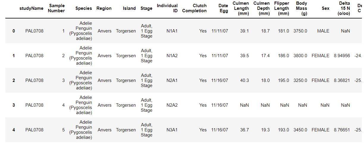
The above image is just a little snippet of what the penguins data set looks like.
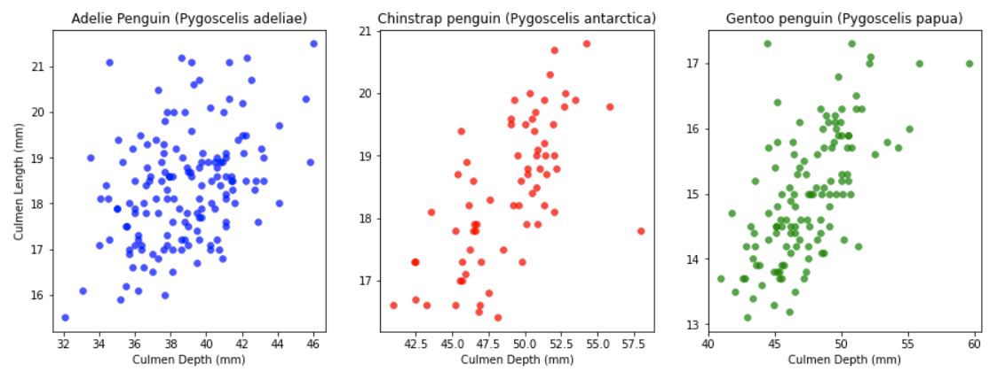
Looking at this data set I would like to compare the Culmen Depths to the Culmen Lengths of each of the three penguin species- Adelie, Chinstrap, and Gentoo. A good way to do this would be using scatterplots with Culmen Depths being the x-axis and Culmen Lengths being the y-axis. Since I’m doing this with all three of the penguin species I would need to create three graphs for each species.
Creating the Graphs
Before we can make our graphs we need to make sure the matplotlib library is in our environment.
Then we create three empty 1 by 3 graphs in an appropriate size.
Next we would like to add the three penguin species into a dictionary with their respective colors along with numbering them from 0 to 2.
Now we can go into the graph process, I decided to put my graphing into a function, but this is up to reader discretion.
Then we assign the penguin species into our graphs. After we use the .scatter to graph the Culmen Lengths against the Culmen Depths.
All that is left now is to label our axes.
The following explanation is coded down below:
from matplotlib import pyplot as plt
#creating the the 1 by 3 empty grid for our 3 scatterplots.
fig, ax = plt.subplots(1, 3, figsize = (15,5))
#putting the penguin species along with what color we want their dots in the scatterplot to be into a dictionary
penguin_species = {"Adelie Penguin (Pygoscelis adeliae)" : (0, "Blue"), 'Chinstrap penguin (Pygoscelis antarctica)' : (1, "Red"),
                   'Gentoo penguin (Pygoscelis papua)' : (2, "Green")}
def f(df):
    """
    This function creates 3 scatterplots of each of the penguin species'
    Culmen Depth and Culmen Length.
    Parameter
    ------------
    df: a pandas dataframe containing the Palmer Penguins data set.
    Return
    ------------
    None
    """
    current = ax[penguin_species[df.iloc[2,2]][0]]
    current.scatter(df["Culmen Length (mm)"], df["Culmen Depth (mm)"], color = penguin_species[df.iloc[2,2]][1],
    alpha = 0.7, linewidth = 0.5)
    current.set(title = df.iloc[2,2])
    ax[0].set(ylabel = "Culmen Length (mm)")
    ax[0].set(xlabel = "Culmen Depth (mm)")
    ax[1].set(xlabel = "Culmen Depth (mm)")
    ax[2].set(xlabel = "Culmen Depth (mm)")
penguins.groupby(["Species"]).apply(f)
Conclusion
We have now created our three graphs that compare Culmen Lengths to Culmen Depths of each of the three penguin species.
This is just one way to graph these two quantitative features. There are also plenty of other features in the Palmer Penguin data set that are waiting to be visualized!
I implore the readers of this post to also try out other different graph types such as histograms, box plots, violins, and more!